Reactions on Pilipinas, Tara Na! for local tourism
Pilipinas, Tara Na! This is Department of Tourism (DOT) new official logo for Pilipinas, Tara Na! Campaign to promote domestic tourism.
The Official Logo was done by Perceptions Inc., DOT, Smart and Perceptions for #pilipinastarana . Brian Ong said that DOT did not spend a single cent.

Details to be launched soon.
What do you think? I like the tagline as it is suitable to the locals. @ninaterol agrees with the taglibe “I actually agree with “Pilipinas, Tara Na!” What could be more colloquial and more direct than “Tara na” (“Let’s go”)? 🙂 #helpDOT”. @edilaga likes “..the new “Pilipinas, Tara Na!” domestic tourism drive. Punchy & direct. So DOT, post guides for penny-pincher travelers like me.”
@aquamanster thinks ” they should have used wow,Tara na? very boring, graphics looks like a logo made in recto, accept more ideas and let’s vote it”. @carloboy08 does not find it appealing ” it’s not really appealing for me. definitely batibot-inspired because of the sun at the back.”
I am not sure if non-Tagalogs can understand “Tara Na”. As a Cebuana, I understand it. Just the same, maybe DOT could test it to non-tagalog speaking places. Also the logo is just not attractive. Honestly, Team Manila could have done a better job at the logo.
Updated – March 18
@TeamManila take on “Pilipinas Tara Na” Tourism logo. Check their logos

Some reactions in twitter reveal that not many know it is for local tourism. Others think the logo is reminds them of Batibot. I will update the reactions every so often.
Interested to be a Blog Watch intern ?
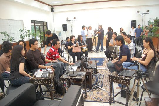
A round table discussion with PCO Secretary Martin Andanar
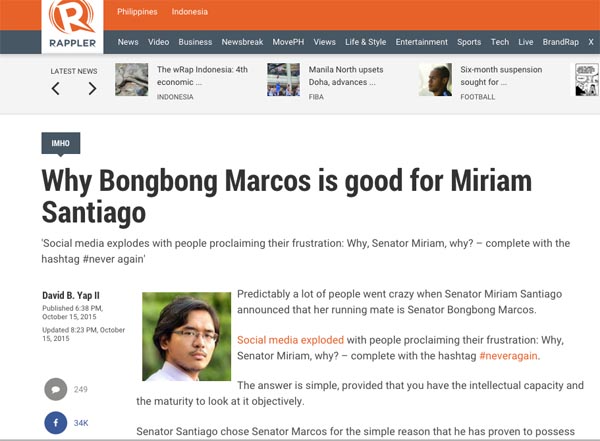
Disingenuous: A response to “Why Bongbong Marcos is good for Miriam Santiago”
About The Author
Noemi Lardizabal-Dado
Noemi Lardizabal-Dado is a content strategist with over 19 years of experience in blogging, content management, citizen advocacy, and media literacy, and over 30 years in web development. Otherwise known as @MomBlogger on social media, she believes in making a difference in the lives of her children by advocating for social change that benefits the greater good. She is a co-founder and a member of the editorial board of Blog Watch . She is a resource speaker on media literacy, social media, blogging, digital citizenship, good governance, transparency, parenting, women’s rights, wellness, and cyber safety. Her personal blogs such as aboutmyrecovery.com (parenting) , pinoyfoodblog.com (recipes), techiegadgets.com (gadgets) and benguetarabica.coffee keep her busy outside of Blog Watch. Disclosure: I am an advocate. I am NOT neutral. I will NOT give social media mileage to members of political clans, epal, a previous candidate for the same position and those I believe are a waste of taxpayers' money. I do not support or belong to any political party. I was part of accredited media covering the Office of the Vice President and Leni Robredo as she ran as a presidential aspirant in the 2022 National and local elections. On August 5, 2021, YouTube announced that I was selected as one of 50 Program participants of its Creator Program for Independent Journalists She was a Senior Consultant for ALL media engagements for the PCOO-led Committee on Media Affairs & Strategic Communications (CMASC) under the ASEAN 2017 National Organizing Council from January 4 -July 5, 2017. Having been an ASEAN advocate since 2011, she has written extensively about the benefits of the ASEAN community and as a region of opportunities on Blog Watch and aboutmyrecovery.com. Organization affiliation includes Consortium on Democracy and Disinformation Updated June 6, 2022